Kia, one of the most recognizable automotive brands in the world, has undergone several transformations since its inception. These transformations have included design overhauls, engineering advancements, branding evolutions, and most notably, a major logo change. The shift in Kia’s visual identity marked a new chapter for the company and signaled a deeper narrative about its future goals and design philosophy.
TL;DR (Too Long; Didn’t Read)
Kia officially changed its logo in January 2021, unveiling a sleek, modern symbol that better aligns with its futuristic vision and electric vehicle goals. The new logo replaced the more conservative oval design, representing a bold step toward innovation and a fresh brand identity. This redesign not only turned heads globally but impacted brand perception and market positioning significantly. The updated logo was a central component of Kia’s strategic rebranding and repositioning in the auto industry.
The Transition: When Did Kia Change Their Logo?
Kia unveiled its new logo on January 6, 2021, during a dramatic fireworks display event in Incheon, South Korea. Marketed as part of the automaker’s “Plan S” strategy, which focuses on electric vehicle development and mobility solutions, the change symbolized more than cosmetic alterations—it was a redefinition of Kia’s purpose and vision.
Kia’s older logo had served the company for many decades. Its simple, oval-shaped design with stylized red text became iconic in its own right, but it began to feel outdated in a rapidly changing automotive world, especially as the industry pivoted toward electric and sustainable technologies.
Why The Change Was Necessary
The reason for the logo change stemmed from the broader strategic imperative: to reposition the brand as youthful, forward-thinking, and technology-driven. Kia’s older logo no longer matched this evolved identity. The new logo embodied:
- Modernity: With sleek, stylized lines, the logo offers a futuristic look.
- Confidence: The sharp angles and symmetry evoke innovation and assurance.
- Movement: As part of their slogan “Movement that inspires,” the logo appears kinetic and dynamic.
Design Details: The New Kia Logo
The newly designed Kia logo is presented in a single, continuous stroke that spells out “KIA” in uppercase but with a stylized, connected design that many have jokingly misinterpreted as “KN.” Designed for digital and physical branding use, the new logo maintains a bold appearance on vehicles, websites, and marketing materials.
Characteristics of the new logo include:
- Minimalism: Strips back unnecessary décor, focusing on clean lines.
- Symmetry: Reflects balance and harmony, both in form and philosophy.
- Continuity: Gives the sense that the brand is always moving forward.
The typography choice especially reflects futuristic design trends that are popular with technology companies, which aligns Kia’s goals of becoming a leader in electric and autonomous mobility.
Impact on Brand Identity
Any logo change naturally brings significant implications for brand identity, consumer perception, and overall market strategy. For Kia, the update was more than a marketing tactic. It served as a clear signal to consumers, competitors, and stakeholders that the brand was capable of reinvention and leadership in the next era of mobility.
According to consumer perception studies conducted in 2021, post-rebrand brand recall for Kia increased significantly, particularly among younger demographics and tech-savvy consumers. Many were drawn by the logo’s tech-centric aesthetic and what it symbolized—a break from the conventional, and an embrace of the bold.
Strategic Marketing and Rebranding
The rebranding didn’t stop at the logo. Kia also launched a new slogan, “Movement That Inspires,” and restructured its corporate mission to highlight sustainability, innovation, and mobility. The move reflects a global trend among automakers to not just sell vehicles but to offer solutions for transportation and environmental responsibility.
Key initiatives that accompanied the branding change included:
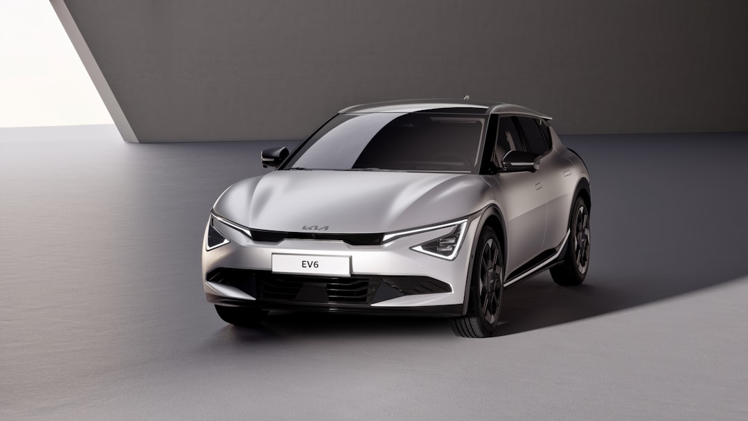
- Launch of new electric vehicles like the Kia EV6.
- Global campaigns showcasing Kia’s commitment to sustainable innovation.
- Revamping dealership layouts and customer service models for better alignment with modern lifestyles.
This coordinated effort meant that the new logo was not an isolated change but part of an overarching evolution for the brand.
Challenges and Mixed Reactions
Despite the ambition, the design was not without its challenges. A significant portion of consumers voiced confusion as to what the logo actually said, with “KN” appearing as a common misinterpretation. As Google Trends data showed, searches for “KN Car” spiked globally after the logo’s introduction.
However, brand experts argue that the mystique and curiosity surrounding the logo drew more attention to Kia than ever before. Conversations around the logo became viral on social media, giving Kia free and wide-reaching publicity. In many ways, the confusion turned into a marketing win rather than a setback.
Influence on Automotive Design Trends
Shortly after Kia revealed its new logo, several other carmakers initiated branding overhauls that leaned toward minimalism and flat design. This confirmed Kia’s positioning at the forefront of a branding trend focused on versatility across digital platforms as well as physical products.
Additionally, the aesthetic inspired further refinements in Kia’s broader design language. Vehicles like the EV6 and upcoming models feature elements that connect visually and conceptually to the modernized logo—sleek lights, sculpted frames, and intuitive tech-driven interiors.
The Future of Kia’s Identity
Looking ahead, Kia’s rebrand, anchored by its redesigned logo, sets the foundation for long-term brand evolution. The company aims to reach a prominent position among global electric automakers, and the transformation is ongoing. While the logo set the tone, it’s the consistent delivery of high-value, eco-conscious vehicles that will ultimately define Kia’s journey forward.
Frequently Asked Questions (FAQs)
- When did Kia change its logo?
- Kia officially changed its logo on January 6, 2021, during a launch event held in South Korea.
- What does the new Kia logo represent?
- The new logo represents movement, innovation, and a bold future direction. It aligns with Kia’s goals in electric and sustainable mobility.
- Why do some people read it as “KN”?
- The stylized typography makes the “I” and “A” appear connected, confusing some readers. Despite the ambiguity, it has sparked curiosity and discussion.
- Is the logo part of a larger rebranding effort?
- Yes. The logo change is just one part of Kia’s larger transformation, including a new slogan, EV launches, and corporate mission centered on innovation.
- Has the new logo affected Kia’s sales?
- While difficult to isolate the logo’s direct impact, Kia experienced increased brand visibility and consumer engagement following the rebrand, contributing to strong performance in new vehicle segments, particularly EVs.