Scratchy fonts are sneaky. One minute your design looks crisp on your laptop. The next minute it looks fuzzy, jagged, or thin on someone else’s phone. Annoying, right? Text clarity matters more than almost anything else in design. If people can’t read easily, they leave. The good news? Most font problems are easy to fix once you know what to tweak.
TLDR: Scratchy fonts usually come from scaling issues, poor contrast, wrong formats, or bad rendering settings. You can fix most problems by choosing better web fonts, adjusting smoothing, improving contrast, and testing across devices. Small design tweaks make a big difference. Clean, readable text keeps people engaged and happy.
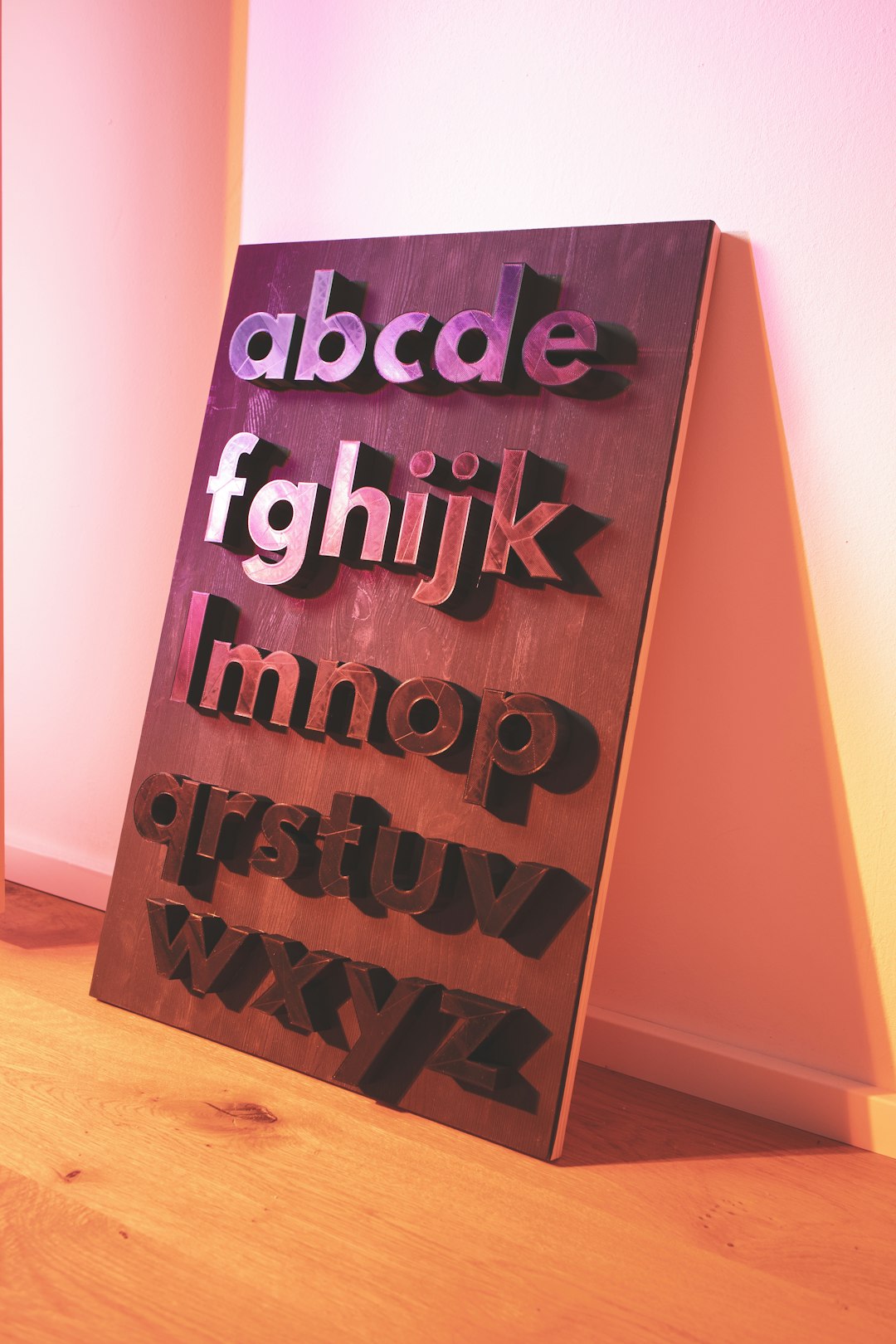
1. Choose Screen-Optimized Fonts
Not all fonts are built for screens. Some were made for print. And print fonts can look rough on digital displays.
Screen-optimized fonts are designed to stay sharp at different sizes. They have balanced spacing. Clear edges. Simple shapes.
Safe choices include:
- Arial
- Roboto
- Open Sans
- Inter
- Verdana
These fonts are tested across devices. They scale well. They reduce that scratchy, pixelated look.
If you’re unsure, preview fonts on:
- A desktop monitor
- A tablet
- At least two phone sizes
Consistency is the goal.
2. Use the Right Font Format
File format matters more than most people realize. Using outdated formats can cause blurry rendering.
Best practice: Use WOFF2.
Why?
- It’s compressed
- It loads faster
- It renders more cleanly
- It’s widely supported
Older formats like TTF can still work. But they are heavier. And sometimes less crisp in browsers.
If your text looks rough only in certain browsers, check your font format first. It’s often the culprit.
3. Adjust Font Smoothing
Smoothing controls how edges are rendered. Without smoothing, text can look jagged. Too much smoothing can make it look thin.
On web projects, developers often use:
- -webkit-font-smoothing: antialiased;
- -moz-osx-font-smoothing: grayscale;
These settings soften edges just enough.
But be careful. Antialiasing can make light fonts look even thinner. If your typography already uses a light weight, test carefully.
Sometimes increasing font weight slightly solves everything. A jump from 300 to 400 may dramatically improve clarity.
4. Fix Low Contrast Issues
Sometimes the font isn’t scratchy. It just looks that way.
Low contrast between text and background can create a vibrating effect. Especially on mobile.
Examples to avoid:
- Light gray text on white
- Thin yellow text on light backgrounds
- Bright neon text on dark blue
Instead:
- Use dark text on light backgrounds
- Or light text on truly dark backgrounds
- Meet WCAG contrast guidelines
Contrast improves clarity instantly. No fancy tricks required.
5. Avoid Improper Scaling
This is a big one.
Stretching or squeezing fonts breaks their proportions. It creates distortion. And distortion creates scratchiness.
Never resize fonts by dragging corners in design software.
Instead:
- Adjust font size properly
- Keep proportions locked
- Use responsive sizing like rem or em
Also avoid fractional pixel sizes. For example, 13.5px can render differently across devices. Stick to whole numbers when possible.
Clean math equals clean text.
6. Improve Line Height and Letter Spacing
Sometimes text looks scratchy because it feels cramped.
Tight spacing causes letters to visually collide. That creates visual noise.
Improve readability by adjusting:
- Line height (1.4 to 1.6 is great for body text)
- Letter spacing (tiny increases help a lot)
This doesn’t change the font itself. But it changes how the eye interprets it.
When text breathes, it feels smoother.
7. Test Across Devices Early
Designers often test only on one screen. That’s risky.
Different screens have:
- Different pixel densities
- Different color calibration
- Different rendering engines
What looks perfect on a Retina display may look weak on a low-DPI laptop.
Always test on:
- iOS and Android
- Chrome and Safari
- A standard office monitor
Catch issues early. Fix them fast.

Quick Comparison Chart
Here’s a simple breakdown of the fixes and what they improve.
| Fix | Main Benefit | Difficulty | Impact Level |
|---|---|---|---|
| Screen Optimized Fonts | Cleaner edges | Easy | High |
| WOFF2 Format | Better rendering and speed | Easy | Medium |
| Font Smoothing | Reduces jagged edges | Medium | Medium |
| Better Contrast | Instant readability boost | Easy | High |
| Proper Scaling | No distortion | Medium | High |
| Spacing Adjustments | Smoother visual flow | Easy | Medium |
| Cross Device Testing | Consistent experience | Medium | Very High |
Bonus Tips for Extra Sharp Text
Want to go further? Try these:
- Use variable fonts for better rendering flexibility
- Avoid ultra-light weights for body text
- Limit decorative fonts to headings only
- Keep background textures subtle
- Don’t stack too many font families
Less chaos equals less scratchiness.
Why Clear Text Really Matters
People scan before they read.
If text looks rough, they lose trust. Fast.
Clean text feels professional. Stable. Intentional.
And it improves:
- Time on page
- Engagement
- Accessibility
- Conversions
That’s huge.
Common Mistakes to Avoid
- Using thin fonts on small screens
- Ignoring zoom behavior
- Overusing text shadows
- Relying only on one device preview
- Picking style over readability
Trendy is tempting. But clarity wins.
Final Thoughts
Scratchy text isn’t just cosmetic. It affects how people experience your content. Thankfully, the fixes are simple.
Choose better fonts. Use the right format. Improve contrast. Adjust spacing. Test everywhere.
Small adjustments. Big difference.
When your text is smooth and clear, everything feels better. And your readers will notice. Even if they don’t realize why.
That’s the power of clean typography.