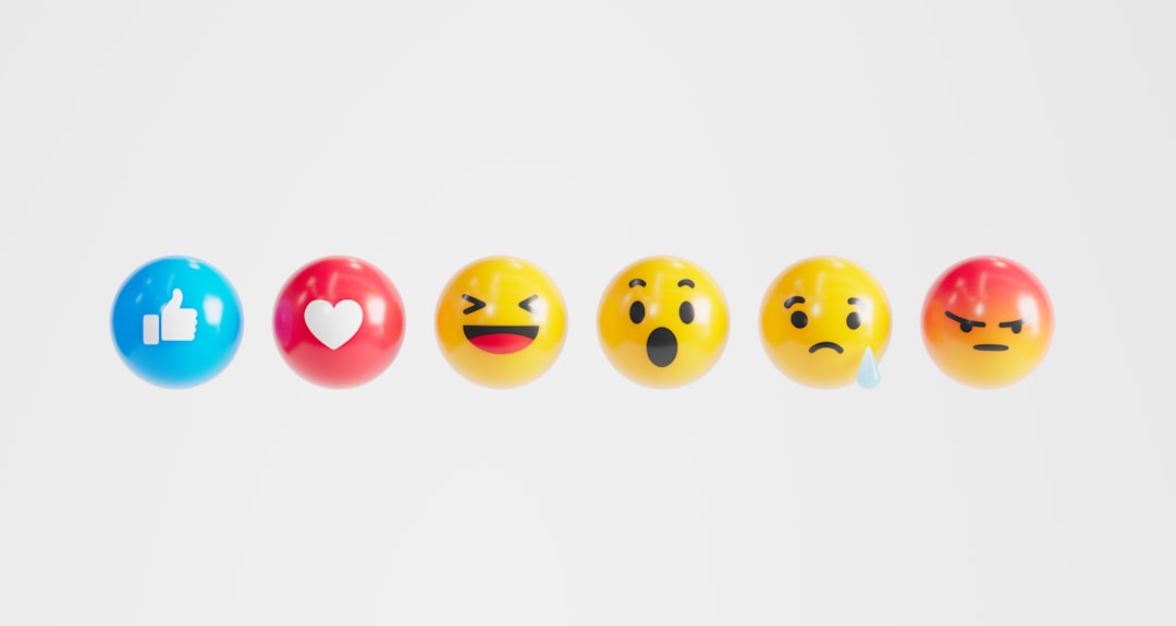
Emojis have become an essential part of digital communication, adding nuance, emotion, and personality to our texts and posts. But if you’ve ever sent an emoji from your iPhone to a friend using an Android phone, you might have noticed it looks a little… different. You’re not imagining things—emoji appearance can vary significantly depending on the device and platform being used.
TL;DR: Why iPhone Emojis Look Different on Other Phones
Emojis are standardized using Unicode, which defines their meaning but not their visual design. Each platform—Apple, Google, Samsung, and others—creates its own emoji artwork to match these definitions. As a result, the same emoji can appear very differently across devices. These variations can lead to miscommunications or confusion, especially with emojis that carry subtle emotional tones.
The Standard Behind Emojis: Unicode
At the heart of every emoji is a piece of code defined by the Unicode Consortium, a non-profit organization responsible for maintaining text standards across digital platforms. Each emoji is assigned a unique code point in the Unicode Standard. This code tells your device: “Display this emoji.”
But here’s the key point: Unicode only standardizes the meaning and function of the emoji—not how it should look. That’s left up to companies like Apple, Google, Samsung, and Microsoft. They design their own version of how each emoji should be rendered visually on their systems.
Platform-Specific Emoji Designs
When you send an emoji, what you’re really sending is a Unicode code point. Your device shows its corresponding design for that emoji—but the receiving device uses its own design for that same code point. This is why the emoji you see on your iPhone may look completely different on a friend’s Android phone.
Here are some of the prominent platforms and their approach to emoji design:
- Apple: Known for clean, realistic designs with a rounded aesthetic.
- Google (Android): Previously had blob-like characters but now uses a more aligned, colorful design similar to other platforms.
- Samsung: Often takes a slightly different artistic direction with bolder lines and shading.
- Microsoft: Used to go for more minimalistic designs but has since updated to be more expressive.
- Twitter and Facebook: Both have their own emoji sets that appear in their apps and websites regardless of the OS.
Consequences of Emoji Variability
While emoji design differences might seem trivial at first glance, they can cause real confusion. Subtle emotional cues embedded within an emoji can be interpreted very differently depending on the artwork presented by each platform.
Examples of Misinterpretation
- 💁♀️ (Information Desk Person): On one platform it may look sassy, while on another it might appear helpful.
- 😬 (Grimacing Face): Looks like discomfort on one platform but may appear to be a smile on another.
- 🙏 (Folded Hands): Is interpreted by many as praying on iPhones but can be seen as a high-five on other systems.
These differences can result in accidental misunderstandings in both casual chats and professional communications. It’s part of why emoji literacy now includes understanding cross-platform design as an unspoken skill.
Emoji Updates and Their Delays
Another layer in the emoji disparity lies in update schedules. When the Unicode Consortium releases new emojis, it’s up to each platform to create their own visuals and roll them out.
This means even if you and your friend are using Android phones, if your devices haven’t been updated to the same software version, you might see different designs—or in some cases, see nothing but a blank box or question mark (�). This is referred to as the dreaded “tofu” character, caused by an unrecognized code point.
The Role of Open Source and Third-Party Emoji Sets
Some platforms choose to implement open-source emoji sets. For example, the emoji set used by Twitter (Twemoji) is open source. This enables consistency across web applications, even if users are on different devices. Other platforms like WhatsApp and Facebook ensure consistent emoji appearance inside their own apps by embedding their own emoji designs.
This approach reduces ambiguity and ensures that an emoji sent in-app appears consistently, regardless of which phone or operating system is being used.
How to Check What an Emoji Looks Like on Other Platforms
Thankfully, several tools are available online to compare how a particular emoji appears across different systems. Some useful resources include:
- Emojipedia: Offers comprehensive emoji reference, including platform-wise comparison of emoji artwork.
- Unicode Emoji List: See how emojis are listed in the official Unicode specification.
These tools can be especially useful if you’re designing messages for marketing, product UI, or documentation that requires emoji clarity across devices.
The Future of Emoji Consistency
Although the world of emoji has become more standardized over the years, full visual consistency remains unlikely due to creative freedom and branding concerns. Emoji are as much a part of platform identity as font or layout style. Apple, for instance, maintains its distinctive emoji design as part of the iOS experience.
However, there is hope for narrowing the visual gap. Designer collaboration with the Unicode Consortium, industry pressure, and user feedback continues to push manufacturers toward more aligned, expressive, and inclusive emoji renderings.
Tips to Minimize Miscommunication
Until a universal visual standard is achieved, users can take a few steps to mitigate misunderstandings:
- Know Your Audience: If you’re texting someone who uses a different device, be mindful that the emoji may look different.
- Use Text Alongside Emoji: Add clarifying words if you’re unsure how an emoji might be interpreted.
- Stay Updated: Keeping your device updated ensures access to the latest emojis and designs.
Conclusion
While emojis serve as a universal visual language, their appearance is anything but universal. Thanks to platform-specific designs, artistic expression, and delayed updates, the humble emoji can tell very different stories from one screen to another.
Recognizing these differences isn’t just interesting trivia—it’s key to effective digital communication in an emoji-driven world. As we grow more reliant on visuals to express emotion, understanding this diversity becomes not a technical footnote, but a modern literacy skill.