A high-converting SaaS landing page should explain the product outcome in the first screen, prove trust quickly, and make the next step feel low-risk. A visitor should understand who the software is for, what pain it removes, and why starting a trial or booking a demo is worth the effort within a few seconds.
TLDR: The strongest SaaS landing pages connect one clear pain point to one clear product promise, then support that promise with proof, visuals, and a simple call to action. For example, a project management SaaS that changed its hero headline from “Work Better Together” to “Cut Project Reporting Time by 40%” could give visitors a sharper reason to start a trial. In one common user case, a 25-person agency may book a demo after seeing that reporting drops from 6 hours per week to 90 minutes. Better landing pages do not just look polished; they reduce doubt.
What Makes a SaaS Landing Page Convert?
A SaaS landing page has a tough job. It must sell something that cannot be touched, tested fully, or understood at a glance. Honestly, it feels like many software pages make visitors work too hard. They hide the product value behind vague claims, stock images, and buttons that say almost nothing.
The best pages do the opposite. They answer three questions fast:
- What does the software do?
- Who is it for?
- What result can the user expect?
Every section should push one of those answers forward. If a section does not teach, reassure, or move the visitor toward action, it likely adds friction.
The Hero Section Must Be Specific
The hero section is not the place for clever wordplay. It is the place for clarity. A strong SaaS hero includes a direct headline, a useful subheadline, a product visual, and a clear call to action.
A weak headline says, “The smarter way to manage work.” That could mean almost anything. A stronger headline says, “Plan campaigns, assign tasks, and track deadlines in one marketing workspace.” That gives the visitor a mental picture.
The subheadline should add proof or context. It can mention team size, use case, speed, or business result. For example: “Built for growing marketing teams that need fewer status meetings and cleaner campaign reports.”
The call to action should match the buyer’s intent. A low-cost self-serve product may use “Start Free Trial”. A complex B2B tool may perform better with “Book a Demo”. Some pages use both, but one should stand out as the main action.
Benefits Should Come Before Features
SaaS buyers care about features, but only after they understand the benefit. A feature says what the software includes. A benefit explains why that matters.
For example:
- Feature: Automated invoice reminders.
- Benefit: Fewer late payments without manual follow-ups.
- Feature: Role-based permissions.
- Benefit: Safer access control as the team grows.
- Feature: Real-time reporting.
- Benefit: Faster decisions without waiting for weekly exports.
Benefit-led copy works because it respects the visitor’s limited time. Nobody wants to decode a feature grid just to find out if the tool solves the actual problem.
Product Visuals Need to Show Real Use
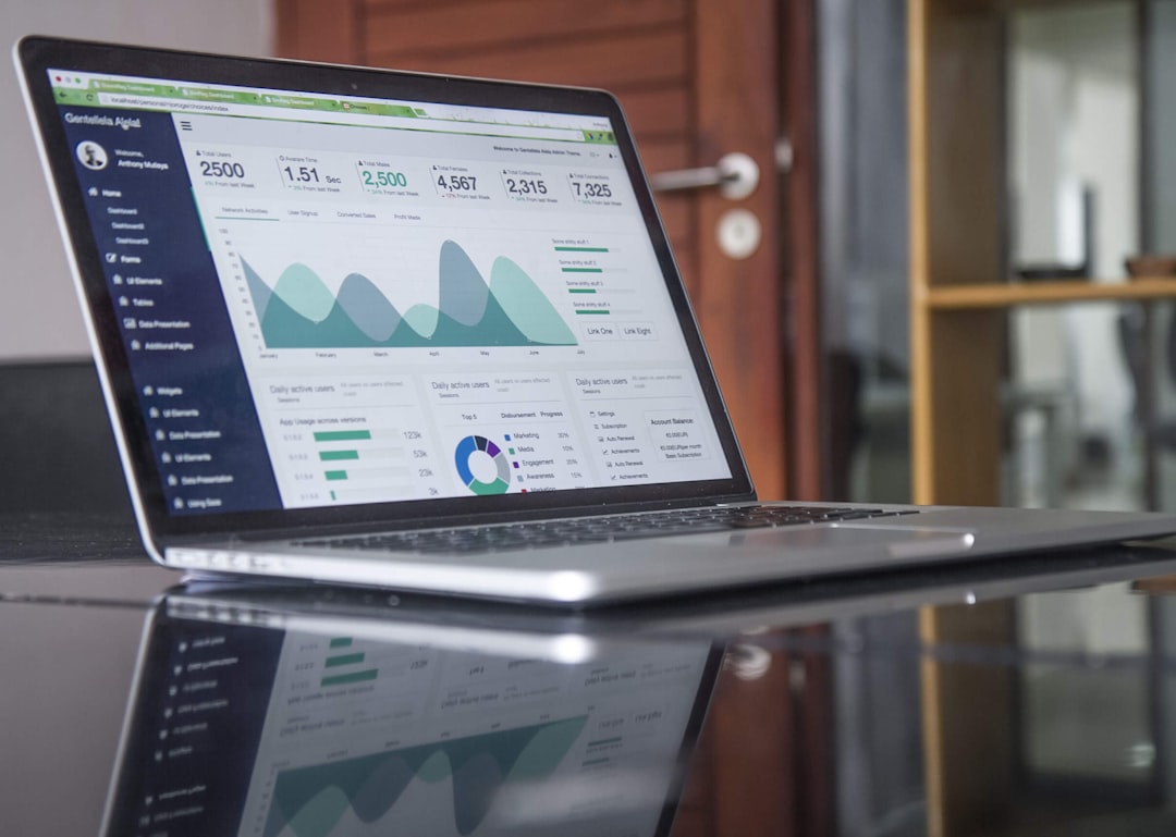
Many SaaS pages show a glossy dashboard screenshot with tiny labels and no context. That rarely helps. Product visuals should support the sales message. They should show what the user can do and why it saves time.
A good visual can include callouts, short annotations, or a focused view of one workflow. For example, a customer support SaaS could show how a ticket moves from intake to resolution. A finance SaaS could show how alerts flag unusual spend.
Video can also help, but only if it gets to the point. A two-minute overview may work well. A seven-minute tour with a slow intro can feel painful. Expect visitors to abandon anything that takes too long to explain the basic payoff.
Trust Signals Should Appear Early
Trust matters because SaaS asks for commitment. Visitors may worry about setup time, data security, poor support, hidden pricing, or yet another tool the team will not use.
Strong landing pages address those concerns before they become objections. Common trust signals include:
- Customer logos from known or relevant companies.
- Short testimonials tied to measurable results.
- Review ratings from trusted software review sites.
- Security badges, compliance notes, or privacy details.
- Case study snippets with numbers and practical outcomes.
The best testimonials are specific. “Great platform” is weak. “The team reduced onboarding tasks by 32% in the first month” is stronger. Specific proof feels real.
The Page Should Match the Traffic Source
A landing page built for paid search should not read like a generic homepage. If the visitor clicks an ad for “HR onboarding software for remote teams,” the page should repeat that intent. The headline, examples, proof, and call to action should all match remote HR onboarding.
This message match lowers confusion. It also improves ad quality and conversion rates. A founder who clicks from a comparison article may need competitor positioning. A manager who clicks from a webinar invite may need a demo offer. Different traffic sources carry different expectations.
Pricing and Trial Friction Can Make or Break Results
Pricing does not always need to appear on every SaaS landing page, but the page should reduce uncertainty. If pricing is hidden, the offer must explain what happens next. Will a sales call take 15 minutes or 45? Will the visitor see a live demo or just qualify for another meeting? These details matter.
Trial pages should also avoid needless friction. Asking for a phone number, company size, budget, and job title before a simple trial can hurt signups. For demo-led products, more fields may be useful. For self-serve tools, fewer fields often win.
A sensible first test is simple:
- Remove nonessential form fields.
- Clarify what happens after submission.
- Add one proof point beside the form.
- Test a stronger button label.
A button that says “Create Free Account” may beat “Submit” because it describes the reward, not the task.
Objection Handling Belongs on the Page
Visitors often hesitate for practical reasons. The page should answer those concerns directly. A SaaS landing page may need sections covering setup time, integrations, migration, support, security, cancellation, or team adoption.
For instance, a CRM landing page could include: “Import contacts from spreadsheets in under 10 minutes.” A security tool could state: “SOC 2 Type II certified, with SSO and audit logs available on business plans.”
These details make the next step feel safer. They also prevent sales calls from filling with basic concerns that the page could have handled.

Conversion Testing Should Focus on Meaning, Not Color Alone
Changing a button from blue to green may help, but bigger gains usually come from sharper messaging. SaaS teams should test headlines, offers, proof placement, form length, demo copy, and product visuals.
Useful test ideas include:
- Outcome-based headline versus feature-based headline.
- “Start Free Trial” versus “Try It Free for 14 Days.”
- Customer quote near the hero versus lower on the page.
- Short form versus multi-field form.
- Static screenshot versus short product video.
The goal is not random testing. It is learning what removes doubt and speeds up action.
FAQ
What is a SaaS landing page?
A SaaS landing page is a focused web page built to promote a software product and drive one action, such as starting a trial, booking a demo, or creating an account.
What should a SaaS landing page include?
It should include a clear headline, benefit-led copy, product visuals, trust signals, objection handling, and a strong call to action.
Should SaaS landing pages offer a free trial or a demo?
It depends on the product. Simple self-serve tools often fit free trials. Higher-priced or complex B2B platforms usually fit demos better.
How long should a SaaS landing page be?
It should be long enough to answer key objections. A simple tool may need a short page. A complex product may need more proof, security details, and use cases.
What is the biggest mistake on SaaS landing pages?
The biggest mistake is vague messaging. If visitors cannot see the product value in seconds, they are likely to leave before considering a trial or demo.