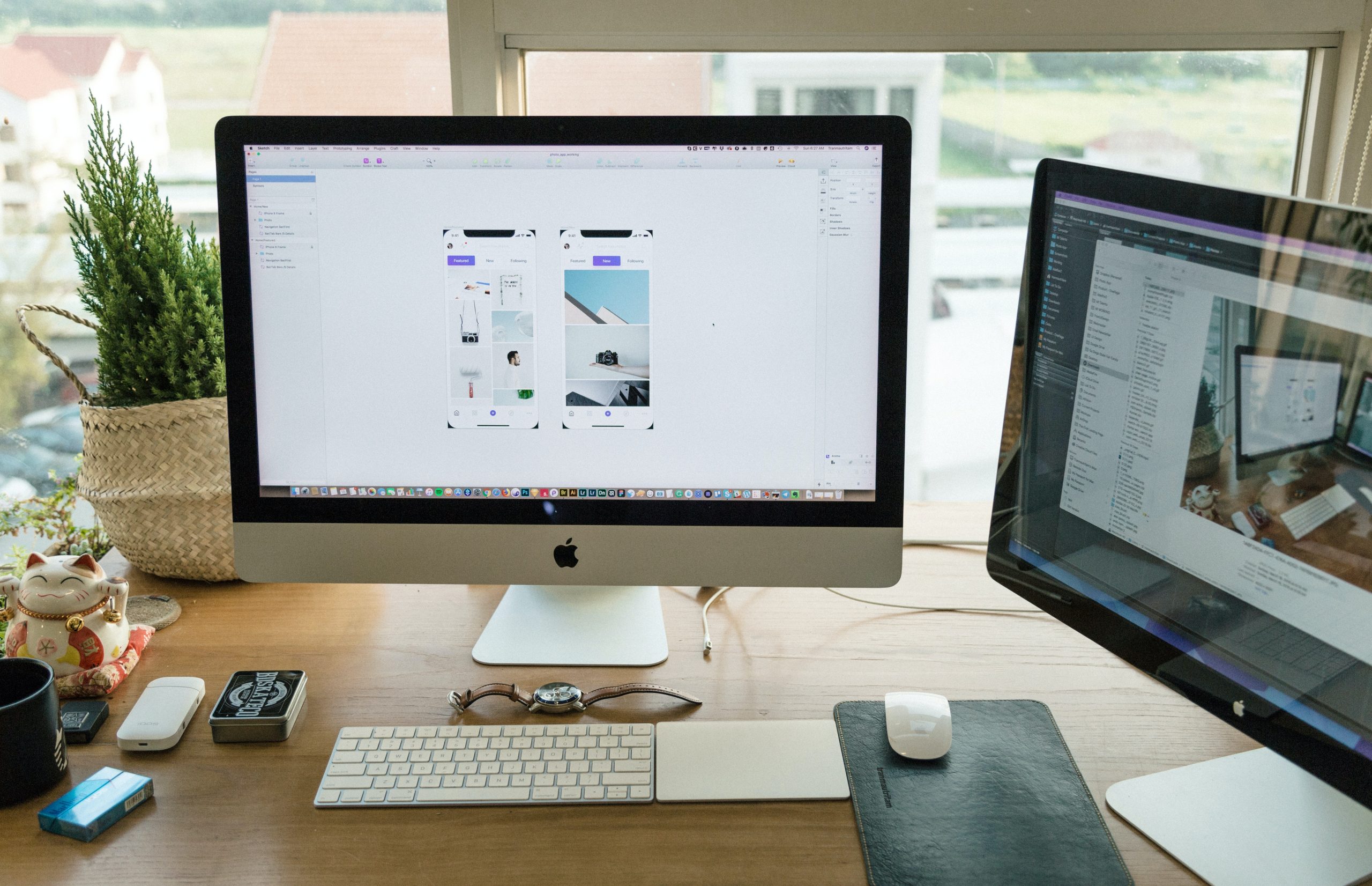
The layout of a website plays a crucial role in attracting and retaining visitors. A well-designed layout can make a website easy to navigate, aesthetically pleasing, and functional. In this article, we will discuss the 5 best types of website layouts along with examples and guidelines.

1. The Simple Layout
The simple layout is a minimalist design that focuses on the content of the website. It is characterized by clean lines, ample white space, and a limited color palette. This type of layout is perfect for websites that prioritize functionality and ease of use.
One example of a website that uses a simple layout is Google. The website is designed with a clean and minimalistic layout that allows users to focus on the search bar and search results.
Guidelines:
- Use a limited color palette to keep the design simple and uncluttered.
- Make use of ample white space to highlight the content.
- Use clean lines and a simple font to ensure readability.
2. The Magazine Layout
The magazine layout is a popular design for websites that feature a lot of content, such as blogs or news sites. It is characterized by multiple columns, varying font sizes, and images that break up the content. This type of layout is ideal for websites that want to create a visual hierarchy of content.
One example of a website that uses a magazine layout is Mashable. The website features a variety of content and uses a layout that showcases different articles in different sections.
Guidelines:
- Use a grid system to organize content into columns.
- Use varying font sizes to create a visual hierarchy of content.
- Use images to break up the content and add visual interest.
3. The Single-Page Layout
The single-page layout is a design that features all the content on a single page. This type of layout is popular for websites that want to create a simple and easy-to-use user experience. It is characterized by a navigation menu that takes users to different sections of the page.
One example of a website that uses a single-page layout is Apple. The website features a variety of products and uses a single-page layout to showcase them all in one place.
Guidelines:
- Use a clear and simple navigation menu to help users find the content they need.
- Use visuals and graphics to break up the content and make it more engaging.
- Ensure that the page loads quickly to provide a seamless user experience.

4. The Grid Layout
The grid layout is a design that features a grid of images or content blocks. This type of layout is ideal for websites that showcase visual content such as photography or art. It is characterized by a uniform layout that allows for easy scanning and browsing.
One example of a website that uses a grid layout is Pinterest. The website features a variety of images that are arranged in a grid layout for easy browsing.
Guidelines:
- Use a consistent grid to create a uniform layout.
- Use high-quality images or content blocks to make the website visually appealing.
- Ensure that the website is optimized for mobile devices to provide a seamless browsing experience.
5. The Card Layout
The card layout is a design that features content arranged in cards, similar to a deck of cards. This type of layout is ideal for websites that want to showcase a lot of content in an organized and visually appealing way. It is characterized by a flexible layout that allows for easy customization.
One example of a website that uses a card layout is Airbnb. The website features a variety of properties that are showcased in a card layout for easy browsing.
Guidelines:
- Use a consistent layout for the cards to create a uniform design.
- Use visuals and graphics to make the cards visually appealing.
- Ensure that the website is optimized for mobile devices to provide a seamless browsing experience.
In conclusion, the layout of a website plays a crucial role in attracting and retaining visitors. Choosing the right type of website layout depends on the purpose of the website, the type of content it features, and the target audience. The simple layout is ideal for websites that prioritize functionality and ease of use. The magazine layout is perfect for websites that feature a lot of content and want to create a visual hierarchy. The single-page layout is ideal for websites that want to create a simple and easy-to-use user experience. The grid layout is ideal for websites that showcase visual content such as photography or art. The card layout is ideal for websites that want to showcase a lot of content in an organized and visually appealing way.
